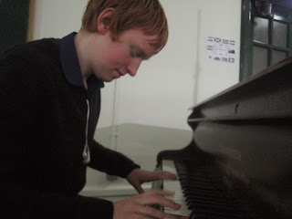
Here are some of the original photos that I have taken my self.
Thursday, 12 December 2013
Wednesday, 11 December 2013
Double page spread example
Here is an example of a double page spread that I want my double page spread to look like. It is a very basic lay out with a picture, text and the heading. Even though it is very simple it looks very professional.
Tuesday, 3 December 2013
Original picture idea
For my original picture i am using two models, who are attending school, and make them pretend to be practicing on the guitar and bass. This will relate to my main article in my magazine, and will appeal to my target audience, as they are in the same age range still attending school.
Plan of front cover
Here is a plan for my front cover, I have decided to choose the name "The Led" as that is a term given to listening to the ban "Led Zepplin" and is related to rock and metal music genre. I have chosen to have the main article about rock music getting taught to school, and kids getting into rock music, as that relates to the age range that i target to.
Friday, 29 November 2013
Props
Props i will be using is two instruments, one bass and one guitar, as these are very music related and could be easily used as a props.
Like these:

Like these:
Presentation of related magazines
Here is a presentation of music magazines related to mine, it contains some information of the magazines, and also the target audience of the magazines.
http://www.slideshare.net/liambruce/presentation1-28734542
http://www.slideshare.net/liambruce/presentation1-28734542
My original photo
I am going to have fellow students to be in my picture, Max and Jason. The picture will be in a music room within my school, and will be of the two models practicing with the instruments in the practice room, and also practicing on the stage in the school hall.
Monday, 25 November 2013
Music cover idea
I have decided to use a group of teens (16-18) playing with instruments, looking like they are practicing. I will make the headline about young teens more interested into playing music. I will use guitars, bass and drums, and will use a music classroom, or a stage of the teens practicing.
Friday, 15 November 2013
My Audience
My audience profile will be male between the age of 15-24, that have a interest in music, specifically rock music which is what my magazine will be about. Here are the facts about kerrang! audience, which is a rock music, which i am using to help base around my magazine. The social group i have chosen is people who listen to rock and metal. I have also decided to aim at working class, as they will be earning money and would more likely be able to afford the magazine.
My Magazine
I have decided to choose that to make a rock and metal magazine, but it will be most of the genres of rock and metal, and will use magazines like kerrang! and classic rock to base on my magazine, bands that will feature on my magazine would be like slipknot, blink 182, of mice and men, and more.
Monday, 11 November 2013
Generic convention of a music magazine
Here is my powerpoint on the conventions of music magazines
http://www.slideshare.net/liambruce/magazines-28119856
http://www.slideshare.net/liambruce/magazines-28119856
Conventions not used
Some conventions not used in my magazine are:
- By-lines (the name of the person who wrote the article, and who took the photo)
- pricing
Tuesday, 5 November 2013
Other conventions used
There are other conventions that I have found out for the magazines:
- Advertisement
- barcodes, and issue number
- lead
Some conventions
some of the conventions I have chosen out for the magazines are:
- mast head (the title of the magazine)
- sub headings talking about the other articles in the magazine
- images on the front cover, one bug main one is usually at the front
Tuesday, 15 October 2013
Pre lim task contents page
Here is the finished contents page of my magazine, i like the coloured boxes helping the text stand out from the background, but i do not like that there is (again) empty space at the bottom.
Pre lim task cover
Here is my finished front cover of my magazine, I like how it is the same colour scheme as the school, bit I did not like the empty space in the bottom right corner.
screen shot rectangle tool
Here is a screenshot of me adding a rectangle, so that the text is easily seen on the contents page, and also makes the texts stand out.
Contents page photo
I have decided to use the picture of a student standing next to a welcome sign for the school, showing all new students are welcome.
Contents Page colours
I have decided to use the same text and colour scheme as my front cover for my contents page, to make it look like it has the same colour scheme through out the magazine, and makes them know thatv it is the schools colour.
Monday, 14 October 2013
pre lim task cover colours
I have decided for my pre lim cover that I will use the colours burgundy and gold, as that is the school colours on the school uniform worn by the children on the picture for the cover
Tuesday, 1 October 2013
Monday, 30 September 2013
Permission sheet
This is the permission sheet that i will use, so that i can use the students in my photos so that i can use it for my magazine.
Subscribe to:
Comments (Atom)


